The time is nearly upon us… GodotCon 2024 is only a few days away! So before I leave my dearly beloved fish and chips behind and check to see if German bread really does live up to the hype, I thought I’d give you all an update on the progress I’ve made with the v0.2.0 update!
The Promise
Before we start, there is one thing I would like to address. Those of you with good memories may remember reading this sentence in an announcement post I made when the official website and forum went live:
Before GodotCon starts on the 12th October, I shall try my absolute hardest to release, at the very least, one pre-release version of v0.2.0.
Today, on the 8th of October, I can safely say that that promise was very ambitious… between general life commitments, visiting family, and me and my friends making our very first cosplays (hint: we’re very excited for season two of Arcane to come out!), I haven’t made as much progress on v0.2.0 as I had hoped I would, so there unfortunately will not be a pre-release for you guys to test out before GodotCon, and for that I apologise.
Now, to start off my redemption arc, I shall proceed to show you some of the things that I have worked on over the last month!
New Objects Menu
Once of the areas of the UI that I felt could definitely be improved the most was the objects menu, as well as all the other menus that involve the player selecting an asset of some kind. For context, this is what the objects menu looks like currently:
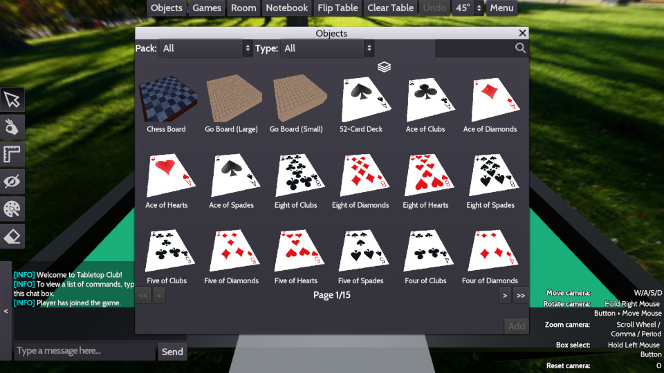
While it is functional, there are a few things based on my experience, as well as player feedback, that can be changed:
- All objects are shown by default, with the player needing to either scan through the pages, or use the filters at the top of the window, to find more specific objects.
- The spinning 3D previews can cause the game to hang under specific circumstances, which also led to the error log getting stupidly big and filling the hard drive like there was no tomorrow. This is due to a fundamental issue with the way I handled multi-threading in the game when loading resources (this issue is a big reason why the re-write is happening).
- Due to the fact that the objects are shown as 3D previews, a pagination system needed to be implemented so that not too many GPU buffers were allocated to VRAM.
So for the objects menu in v0.2.0, I had two main changes in mind:
- To change the way objects are organised, so that it is as intuitive as possible to find what you want with the least amount of clicks.
- To use icons instead of 3D previews to not only stop crashes, but also to make the objects menu load faster (especially if you have objects imported with very high vertex counts).
I haven’t fully figured out how I’m going to implement the icons as of yet (hence why there are no icons in the following screenshot), but you can still see what I had in mind for the new objects menu:
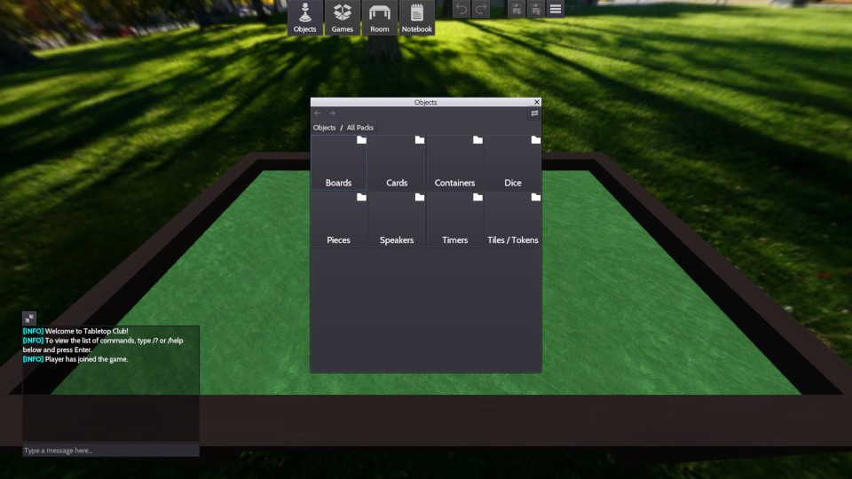
In a sense, it works just like a file explorer in that you have objects in various folders, and by default the menu shows you the different types of objects that you can spawn for all asset packs that you have imported.
This structure also allows for sub-folders to help keep assets organised. For example, under “Dice” it will show sub-folders for each of the different number of sides (d4, d6, d8, etc.), and under “Cards” it will first show pre-made decks of cards, since that is most likely what players are looking for, alongside a sub-folder for individual cards, which players can click into if they are looking for a specific card. This also makes stacks of cards easier to find, as they are not lost in the middle of potentially hundreds of cards.
You may have also noticed a small settings button on the top-right hand corner of the window. You’ll never guess what it’s for!
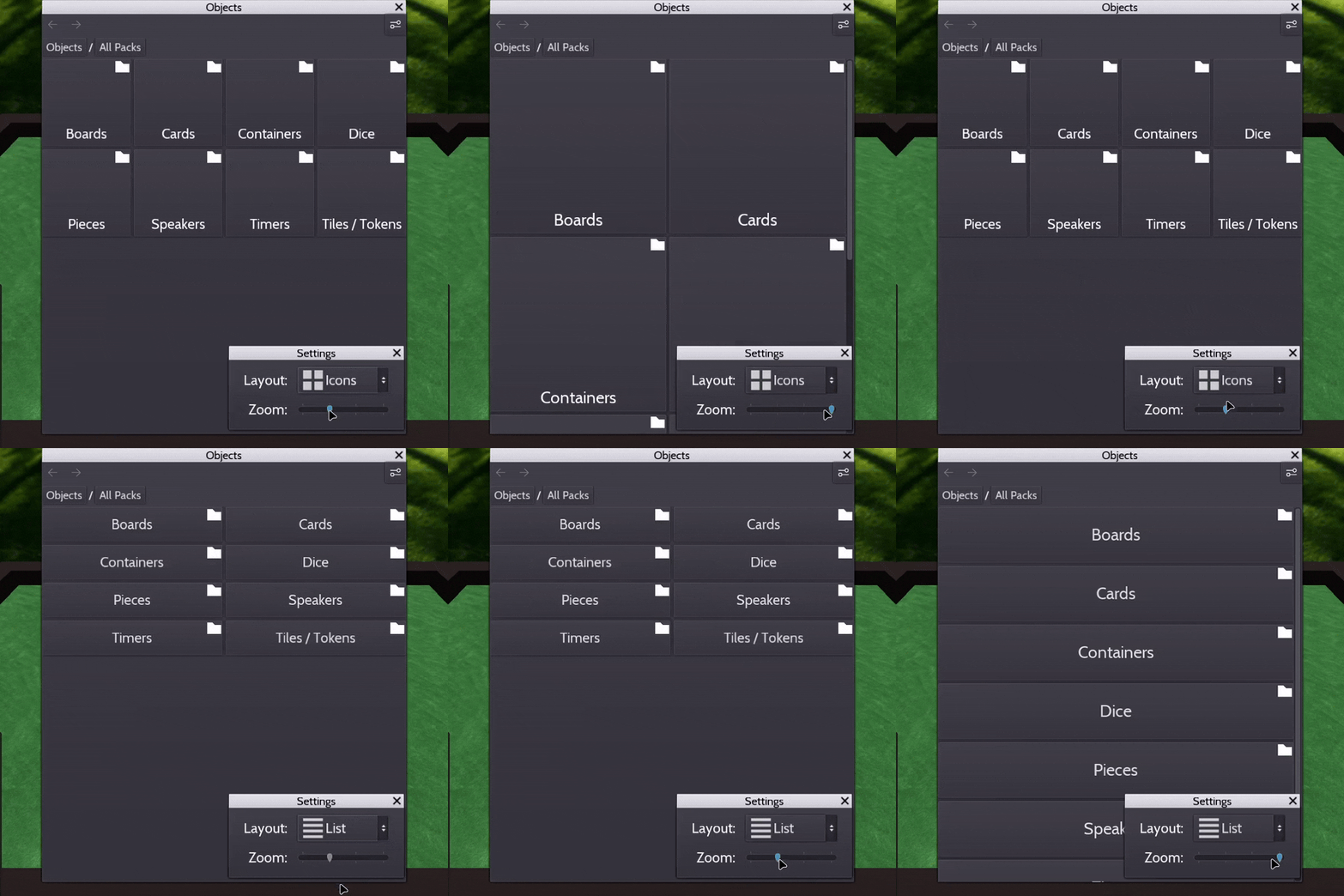
That’s right, you can now change the size and the appearance of the buttons in the objects menu! I bet the founding fathers would cry with how much freedom this menu gives you.
Placing Objects
Currently, when you add objects to the room via the objects menu, it spawns a new instance of the object at the current “spawn point”, which by default is in the centre of the table. This is another area of the UI that I wanted to re-visit, as I personally think it could be a lot more intuitive.
Firstly, the only indication to the player that the object has been spawned is the text at the bottom of the menu, not a visual indicator in the room itself. Secondly, the spawn point is hidden, and players probably don’t know it even exists if they haven’t right-clicked the table to set the spawn point somewhere else. Lastly, this way of spawning objects can easily lead to other objects on the table getting knocked over, especially if players leave the spawn point in the centre of the table, where there are likely to be objects already.
Now, what if I told you that the new system for placing objects on the table is, like, 1000x better:
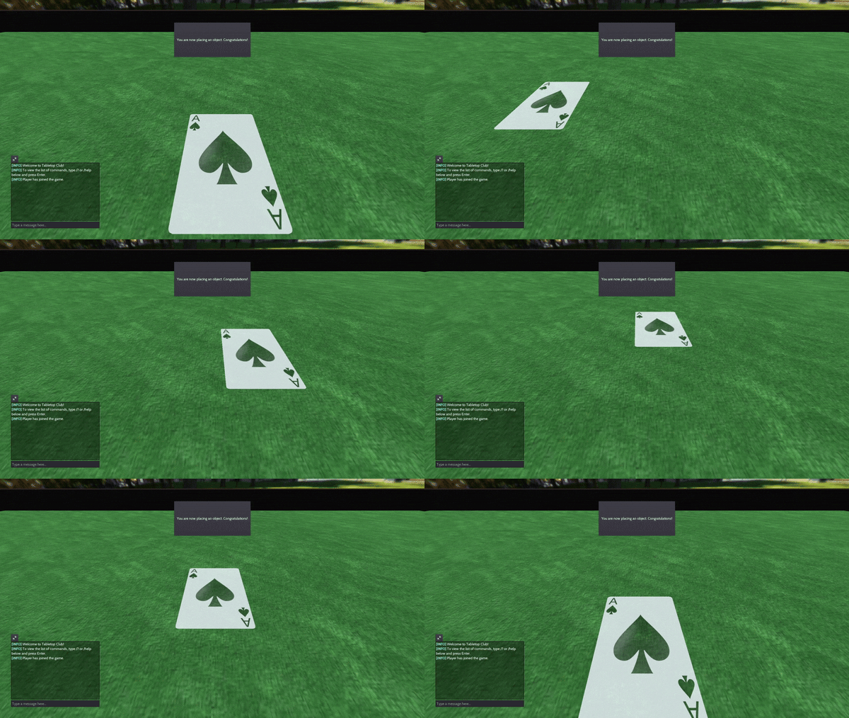
So when you select an object in the objects menu, the objects menu disappears and you get a transparent version of the object under your mouse, allowing you to place it anywhere you want on the table, or on top of another object if you so wish.
For those of you wondering what it says at the top while you are placing an object, it currently says “You are now placing an object. Congratulations!” - I’m sorry to say that you will be getting no such congratulations when you get your hands on v0.2.0, and that you’ll have to live with control hints instead… once I figure out how to display different controller icons depending on what type of controller is being used (e.g. XBOX, PlayStation, Nintendo, etc.)
Improved Card Meshes
You may have noticed in the last GIF that the Ace of Spades is looking a lot more “curvy” than usual. Well, that’s because it is! In fact, all cards will have curved corners in v0.2.0, just like in real life! I swear, this game is getting more realistic by the minute.
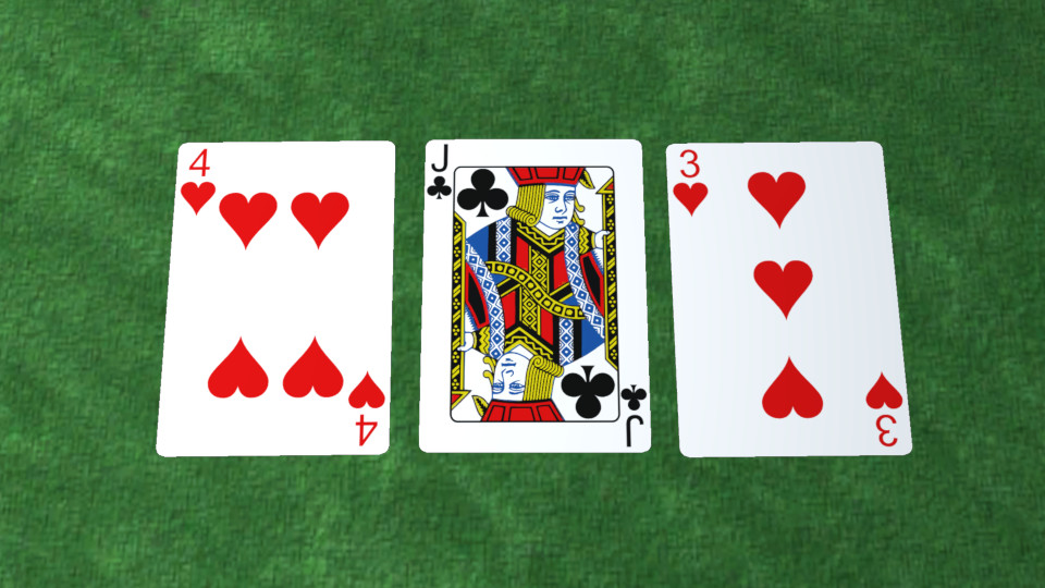
I’ll also be adding a new property to the config.cfg file for cards, so that
you can change how big or small these corners are for your cards. You’ll even
be able to disable them altogether if you’re more into right angles than curves.
Controller Support
Guess what - everything that you’ve seen so far can also be used with a game controller! But you might be asking, “hey, how do you get to the objects menu without a mouse?”. Well, I’m glad you asked, because it just so happens there’s a GIF right here:
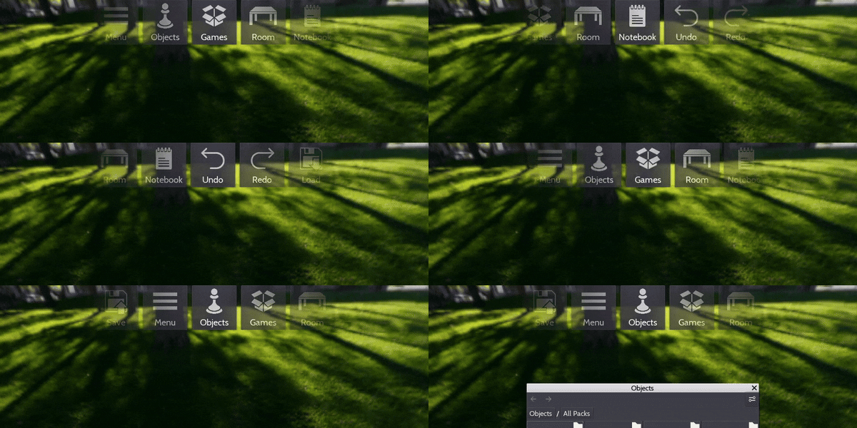
The menu bar at the top of the UI is controlled with the D-Pad. The left and right buttons scroll through the different buttons, and the down button presses the currently selected button.
As for the tools that would usually be in the left-hand side of the screen, my current plan is to have them appear when you hold down the left bumper (LB) button, as a radial menu. Then, while the LB button is held down, you select which tool you want to use by using either joystick to point in the direction of one of the tools around the circle.
Bear in mind that the control scheme is very much subject to change depending on playtesting and player feedback, so this is by no means final!
Physics Jitter Fix
And last but not least, one area of the game that has received probably the most amount of feedback so far, and that I’ve been paying extra special attention to during this re-write, is the physics.
For the game developers that have come before me, that have had to deal with physics engines doing things that make no sense, I feel your pain now. I think with all of the research I have done into concepts like inertia and dampening, I might have a solid shot at getting a physics degree at this point.
All this to say, for most of the physics issues the game has currently, I am pretty much at the mercy of the physics engine, which currently is Bullet. My hope is that in the future, once the game is migrated to Godot 4, that either GodotPhysics or Jolt will be able to recover some of my lost sanity. However, there are some aspects of the physics that I have learnt I actually have control over, at least, when I don’t miss notes in Godot’s documentation…
For example, when you miss the section of the documentation that says “please don’t scale CollisionShape nodes so the physics engine can optimise stuff”, you end up with a dice rave:
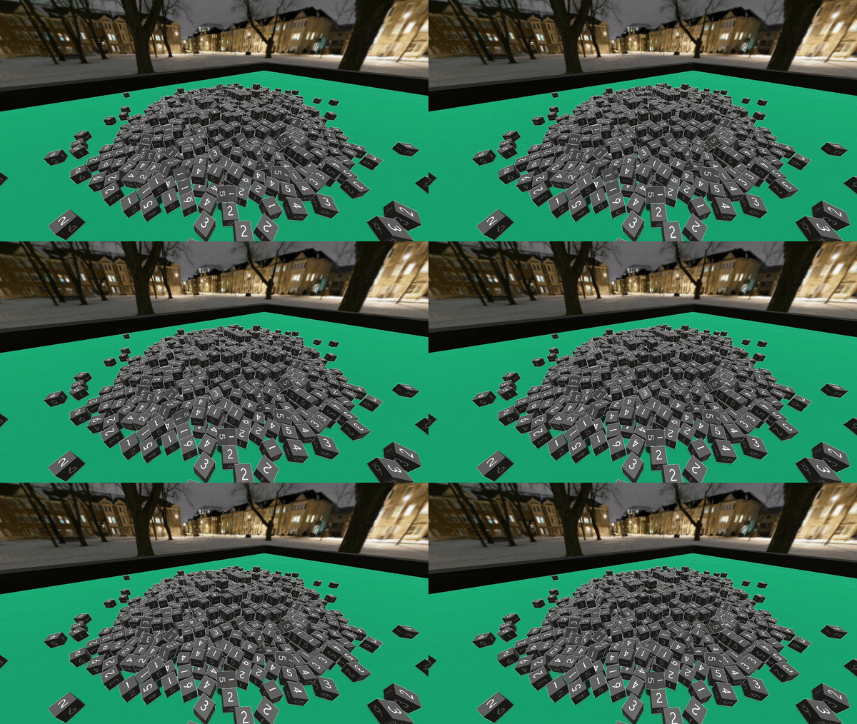
You might have seen this issue yourself when rolling dice onto the table, where the dice dances on the surface before eventually settling down in-place.
So when you find the note in the documentation that says “please don’t scale CollisionShape nodes”, and then proceed to not scale CollisionShape nodes, and instead scale the shapes themselves, you get a much more boring dice rave:
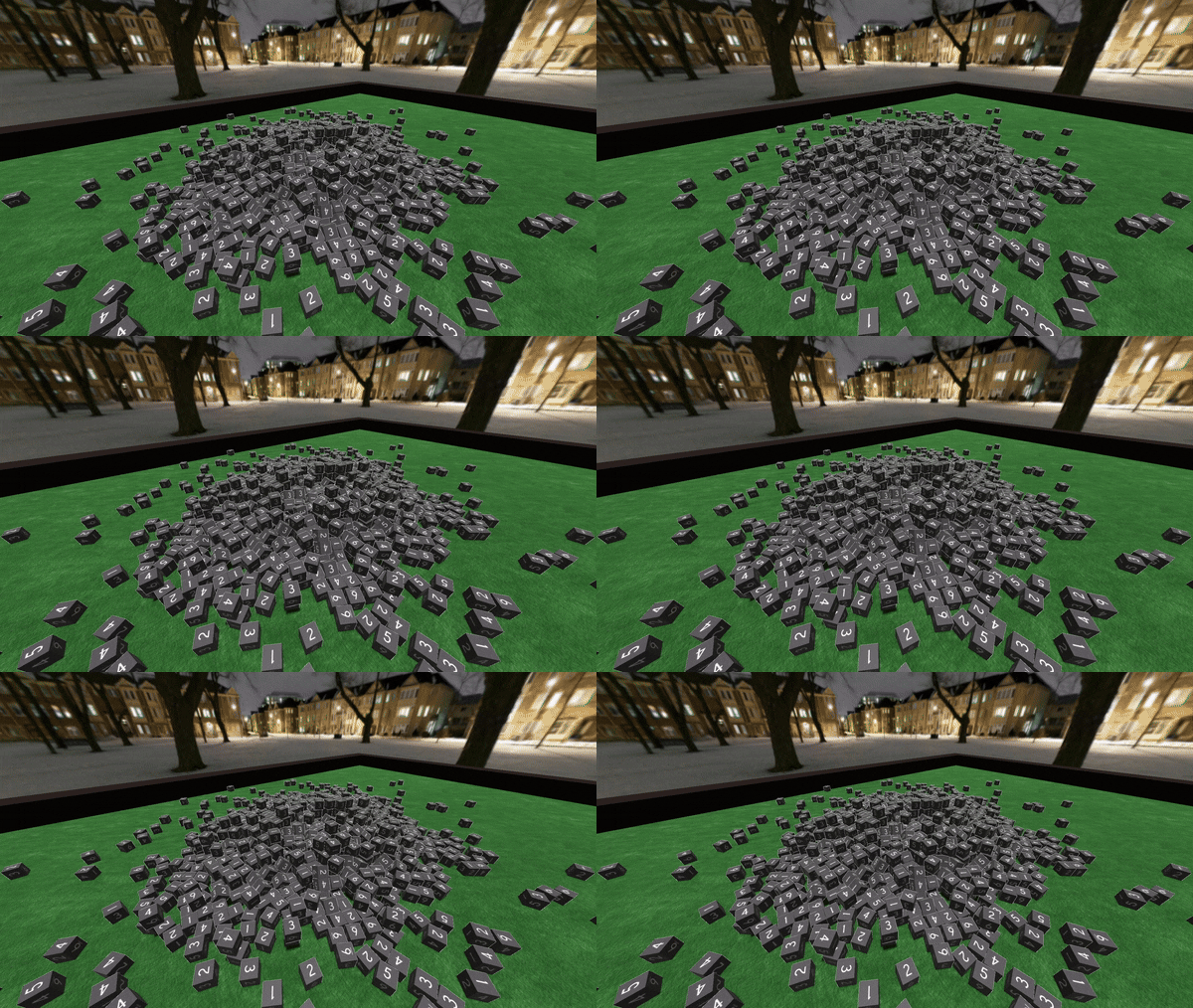
This, I think you guys can agree, looks a lot better than it did before! Hopefully, little discoveries like this one will lead to much better physics performance overall in v0.2.0.
GodotCon
That’s it for game updates! Now it’s time to pack my bags and head to Berlin to see some cool things, like gates, walls (well, what’s left of them), towers, and what else? Oh yeah, GodotCon!
I’m really looking forward to seeing what games and tools everyone’s made, and to learn from people way cleverer than I am! If you happen to spot someone that kind of looks like PirateSoftware, except British and not nearly as cool or good-looking, then feel free to say hi!
I’ll also try and post updates from my adventure in Berlin over on Mastodon as well, so feel free to follow me there if you’re interested!
Bis bald! / Until next time!